

Updated August 2026
A visual case study…
National Geographic Kids, Made Playable
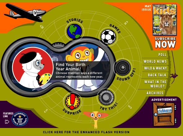
The National Geographic Kids homepage was built like a toy: a pair of binoculars kids could look through, with the magazine’s franchises — Back Talk, What in the World?, Wild & Wacky and more — rebuilt as things to type into, unscramble, and print. Oddtoe designed and animated that homepage and a dozen of the interactive modules behind it. Every image on this page is the real work, running again — starting with the homepage itself: click the five markers to read it the way a nine-year-old did, region by region.
The project in one paragraph
What did Oddtoe make for National Geographic Kids?
Oddtoe ran the digital side of National Geographic Kids — online editor, designer, and cartoonist in one — and produced the award-winning site’s interactive homepage — the binocular navigation above — and designed its games and content for nearly six years: a rolling immersive feature in layered parallax, plus the game modules that turned magazine pages into play — caption tools, photo puzzles, fill-in stories, and quiz engines the editorial team could refill themselves.
Oddtoe is an experiential design and generative-AI animation studio based in Melbourne, creating projection, installation, and animated work for events, venues, and galleries.
Everything hung off one front door
One homepage, twelve builds
The hub is the binocular homepage — the site’s playful front door. Around it, the twelve interactive builds Oddtoe designed for National Geographic Kids: the games and puzzles kids played, the monthly immersive scene, the characters, and the promos that pointed back to print.
The design problem
How do you move a kids’ magazine onto a screen?
Not by scanning the pages. A nine-year-old opens a website the way they open a toy box — so the homepage became a pair of binoculars, the subscribe card a magazine cover that flips, and every franchise from the printed magazine became something to do rather than something to read.
The brief had a second audience: the editors. A game that needs a developer for every new issue dies after three issues. So the modules were built as refillable engines — the fill-in stories read from a plain text file, the quizzes from an XML file — and the monthly immersive feature ran on a repeatable layered template. The magazine could keep the site as fresh as the print run without rebuilding anything.
A scene, not a banner
How did the immersive homepage feature work?
The homepage carried a rolling immersive feature: a 738×330 scene built in three animated layers — foreground, middleground, background — so an underwater world or a wolf pack had depth kids could feel. Each edition was a fresh scene composed on the same layered template.
The template is the quiet hero. Because every scene decomposed into the same three layers, a new edition meant new artwork, not new engineering — the design rounds in the archive move from underwater scenes to wolves to outer space on one production system. It is the same character-and-world thinking Oddtoe now sells as character design services for brands.
The lineup
The interactive modules
Every module was built around one franchise and one verb.
| Module | Franchise | What kids do |
|---|---|---|
| Binocular homepage | The whole magazine | Explore Stories, Games, Sound Off and Try This through the lenses |
| Immersive feature | Homepage lead | Watch a layered scene animate; click through to the story |
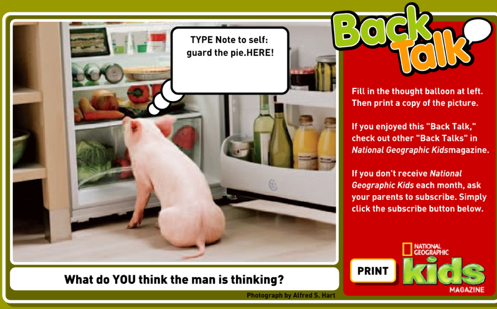
| Back Talk | Caption feature | Type a thought balloon onto a real animal photo, then print it |
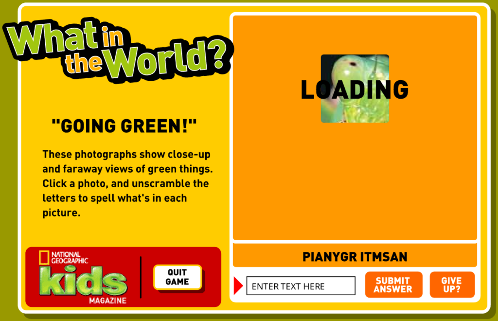
| What in the World? | Photo puzzles | Unscramble letters while a mystery close-up zooms out |
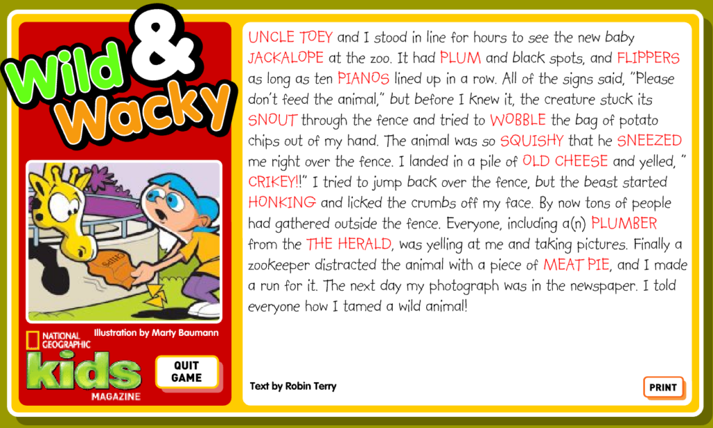
| Wild & Wacky | Fill-in stories | Fill fifteen blanks and get an illustrated story back |
| Brainteasers & Green-o-Meter | Quizzes | Answer questions, get a rank — refilled by editors via XML |
| Characters & e-cards | Mascots | Meet the dog, raise the virtual pet, send the cards |
Alongside these: a magazine-cover animation for the subscribe card, a WordGirl Funny Fill-Ins crossover with PBS, and promotional builds for the book range.
The work, up close
Play the archive
Three modules as kids saw them — captured from the original builds running, not mock-ups. Click any screen to view it full size.
Type & print
Back Talk
Unscramble the photo
What in the World?
The story payoff
Wild & Wacky
Three layers deep
The scene is the welcome mat
The immersive feature — running here, live, in a Flash emulator: an underwater world painted in three layers behind the welcome banner, with the photo rail racked underneath — sea lions in the middleground, the foreground waiting for a click. It never begged for attention — it made the page feel inhabited, the way a good toy shop window does. That restraint is a design position: motion sells the world, the words sell the click.
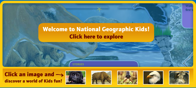
This is the original module running live in your browser — move around it; the “explore” button pointed at the old site, so it politely stays put.
What the engagement covered
Six workstreams, one site
The National Geographic Kids work ran across six fronts — each tile is a slice of what shipped.
Character work, engine work
What does this project say about Oddtoe now?
Everything on this page is character design plus systems thinking: mascots with personality, worlds with depth, and engines an editorial team could drive without a developer. That combination — not any single game — is the deliverable.
It is also the through-line to the studio’s current work. The layered scenes and refillable engines have become generative AI animation pipelines; the mascots and side characters have become character design services; and the instinct that a screen should be a toy runs straight into Oddtoe’s brand activations for venues and events.
The needle, moved
What the playable magazine did
Play was the strategy, not the reward. While Oddtoe ran the site’s digital side, the audience — and the magazine behind it — grew with it.
Questions & Answers
The National Geographic Kids work
Verbs, not pages
The pig, the balloon, and the print button
The clearest statement of the whole project is Back Talk. A real photograph — a pig staring into an open fridge — and one empty thought balloon with the words TYPE HERE! The kid supplies the joke, and the punchline of the interface is the button underneath: PRINT.
That print button is doing serious work. It turns a web page into a thing a kid makes and takes away — onto the fridge, into the classroom, next to the magazine it came from. The interactive is not competing with print; it is feeding it.
Each franchise got the same treatment: find the one verb a kid wants to do, and build the whole screen around it. What in the World? is unscramble. Wild & Wacky is fill in the blanks — fifteen of them, rewarded with an illustrated story starring whatever the kid typed. The quizzes are rate yourself, with ranks like “Supreme Sea Monster” doing the encouragement.
One verb per screen is still how Oddtoe starts an interactive brief, whether the audience is nine or thirty-nine. It is the fastest way to find out whether an idea is an experience or just a layout — and it is the thinking behind the studio’s brand activation work today.
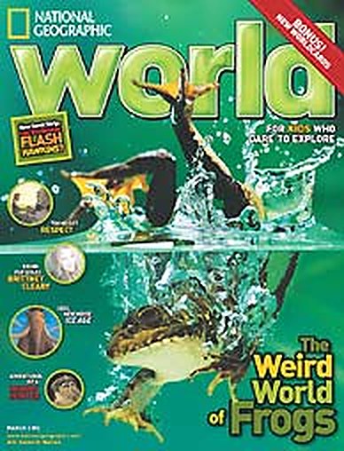
This is really when Oddtoe took off. Comic strips, game design, interactive storytelling — all at National Geographic. Loved it.

Oddtoe
About the National Geographic Kids years
The magazine behind the site: over 1.3 million copies in circulation, a readership in the millions.
From flea circus to front page
Where the characters came from
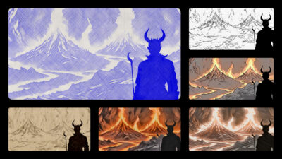
Before and alongside the National Geographic Kids work, Oddtoe was drawing its own characters — the Parasite Island cast and the illustrated portfolio the studio was built on.
Those characters carried into the magazine work: the quiz engine’s logo is a cartoon toe — the studio’s namesake — and original characters run through the games, e-cards and homepage scenes. Oddtoe also drew a comic strip that ran in the printed magazine — a story this site will tell in its own case study.
Characters built for kids have to survive rough handling. They get printed badly, animated at small sizes, and judged in half a second. Designing under those constraints is a discipline, and it is the reason the studio’s character design services start with silhouette and personality before style.
The archive behind this case study — the layered scenes, the engines, the cast — is also the seedbed for Oddtoe’s own stories, now made with a generative AI animation pipeline the original Flash toolkit could only dream about. Same instinct, faster hands.
Tell us what you are imagining…
Want to talk about a project?
"*" indicates required fields